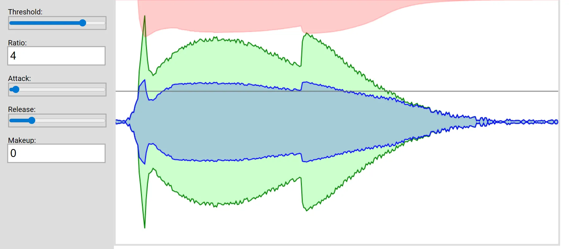
Visualizing audio compressors
I found it difficult to understand audio compressors when I first learned about them.
Compressors are audio engineering tools that apply dynamic range compression: they reduce the difference between the loudest peaks and the quietest moments (they compress the dynamic range) of an audio signal — and they’ve been critical to audio production for decades.
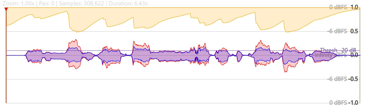
Compressors can transform tracks by making their volume more consistent. However, the most useful compression is often very subtle. It can be very hard to hear, at least to me. So I made a tool to visualize audio compressors.
Try it at citelao.github.io/compressor-visualizer!
What are compressors?
It’s worth a longer post, but compressors are like a robot on your gain knob. Most compressors are downward compressors:
- If your signal reaches a certain threshold, they reduce it by a certain ratio.
- They can respond more slowly or quickly by adjusting attack and release speeds.
- They can account for the overall reduction in volume by applying optional makeup gain.
That’s it!
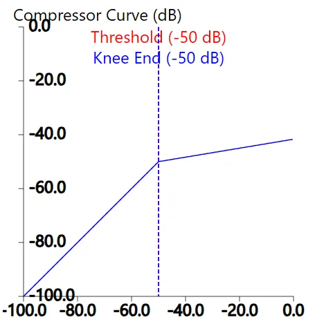
Output (y-axis) is reduced for any input (x-axis) over the threshold
With those knobs, producers can:
- Make a track more even so it sits better in a mix.
- Remove harsh “ess” sounds in speech.
- Limit sounds to avoid blowing out speakers.
- Add that distinctive pumping sound to trance music.
- Make songs audible at low volumes.
- Adjust drum hits to last longer.
- Adjust drum hits to sound shorter.
Some of these changes are very prominent, some are subtle. So I find it helpful to visualize how compressors change audio. Especially while learning.
Conclusion
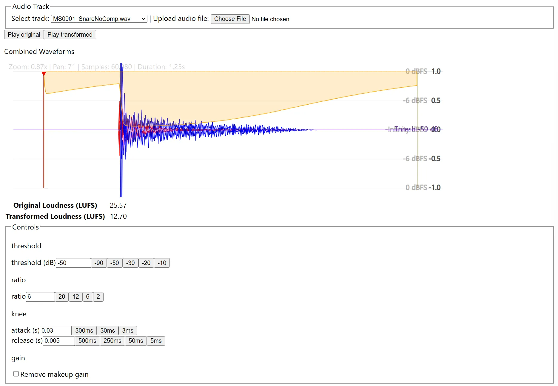
It’s not super polished, and there’s plenty of work to do, but it works! Upload your own audio or use some sample tracks, then play with the controls to see how the compressor responds.
I hope you enjoy! citelao.github.io/compressor-visualizer.
Appendix: See also
Many actual compressors will show you a “live” feed as they process audio:
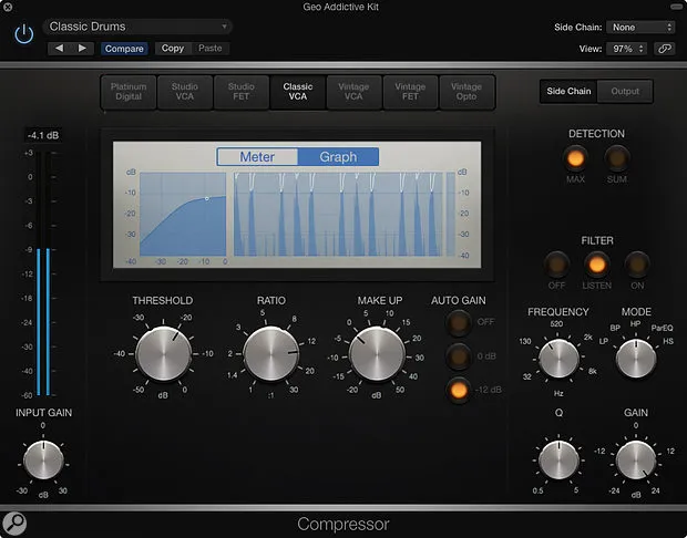
Logic’s live compression graph in its built-in compressor (via Sound On Sound)
However, it can be hard to visualize a whole track or inspect the effect at the millisecond level. My visualizer can help: it shows you the whole track, and you can zoom in to your heart’s content.
Someone else created a visualization that shows a waveform for simulated audio, on CodePen (found via Reddit):
The visualizer on CodePen
They implemented the compression algorithm manually, which is really cool! My visualizer uses built-in WebAudio APIs, so you can test it with your own sounds.
There’s a lot of cool stuff in this space.